You Should Keep an Eye on these 10 UX & UI Design Trends for 2023
UX (User Experience) & UI (User Interface) design are two important aspects when designing websites and web applications.
UX refers to the overall experience a user has when interacting with a product or digital solution, while UI refers to the visual design and interaction elements that the user sees and uses. Good UX and responsive UI design are crucial for the success of digital products and services as they help users to use the product intuitively, hassle-free and have a positive experience. We have listed some important trends for 2023 for you that you should pay attention to this year in order to recognize developments early on and take advantage of them.
UX (User Experience) & UI (User Interface) design are two important aspects when designing websites and web applications. UX refers to the overall experience a user has when interacting with a product or digital solution, while UI refers to the visual design and interaction elements that the user sees and uses. Good UX and responsive UI design are crucial for the success of digital products and services as they help users to use the product intuitively, hassle-free and have a positive experience.
We have listed some important existing and new trends for 2023 for you, which you should pay attention to this year in order to recognize developments at an early stage and take advantage of them.
Irrespective of this, design adjustments should be examined and tested with your own target group so that there are no nasty surprises afterwards. Learn more about it on our blog:
Trend 1 - Immersive Scrolling “Scrollytelling”
Immersive scrolling, or motion scrolling, uses powerful storytelling techniques to immerse users of websites and other applications in a deeper, more interactive experience. It uses parallactic scrolling, animated transitions and other visual effects to make the page's content livelier and more engaging - as the ATMOS demonstrates with a virtual sightseeing flight.
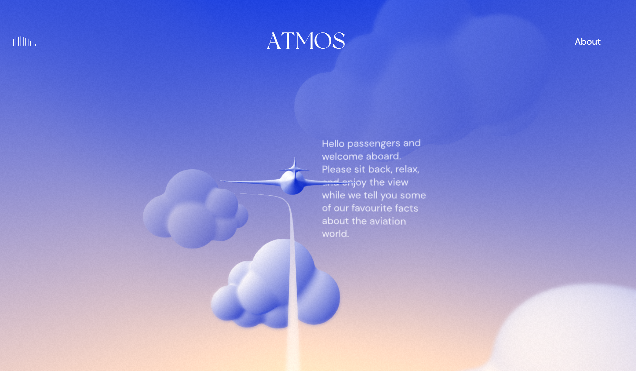
Through the use of animations and interactions, “infinite scrolling“ can help users stay on the page longer and engage more deeply with the content. Visiting a website should be an experience. This method is also known for social media applications such as Twitter, Facebook, Instagram & Co.
Overall, immersive scrolling offers an innovative and exciting way to improve user experience and increase interest in a page's content. However, it's important to note that it's not suitable for every project and that a healthy dose of animation and interaction elements is essential to ensure a pleasant user experience.
Trend 2 - 3D visualization
3D visualization is a key trend in UX & UI design that ensures an engaging user experience. 3D models and animations can be used to create a realistic representation of products and content on a website or application. 3D graphics and models bring depth and dimension to the design, making it more vivid and interactive. This technology can be used for product presentations, process visualizations or for interactive maps and diagrams - as the example of a story through various living scenarios with animated avatars by Wandermut Jaunt shows.
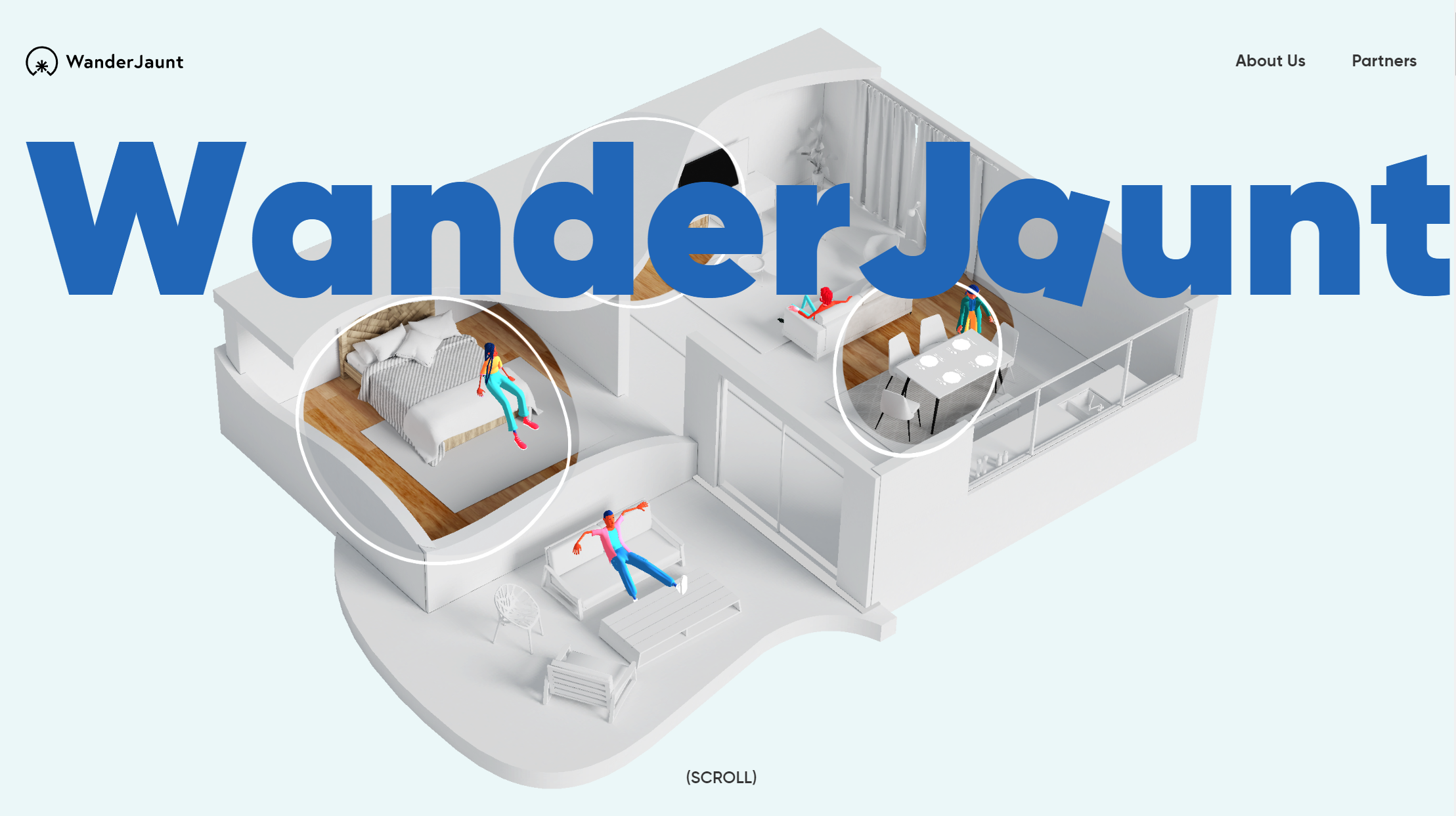
By integrating 3D visualizations, users can view products from different perspectives and interact with them interactively, which can facilitate purchasing decisions.
The combination of these photorealistic visualizations with user-centered workflows & connections to peripheral systems by means of system integration (e.g. to ERP, CRM, PIM; CAD etc.) result in 3D configurators that guide the customer through the offer. Varied products can be presented clearly and support the customer in the decision-making process. An example of this is the sofa configurator from Artanova Horst.
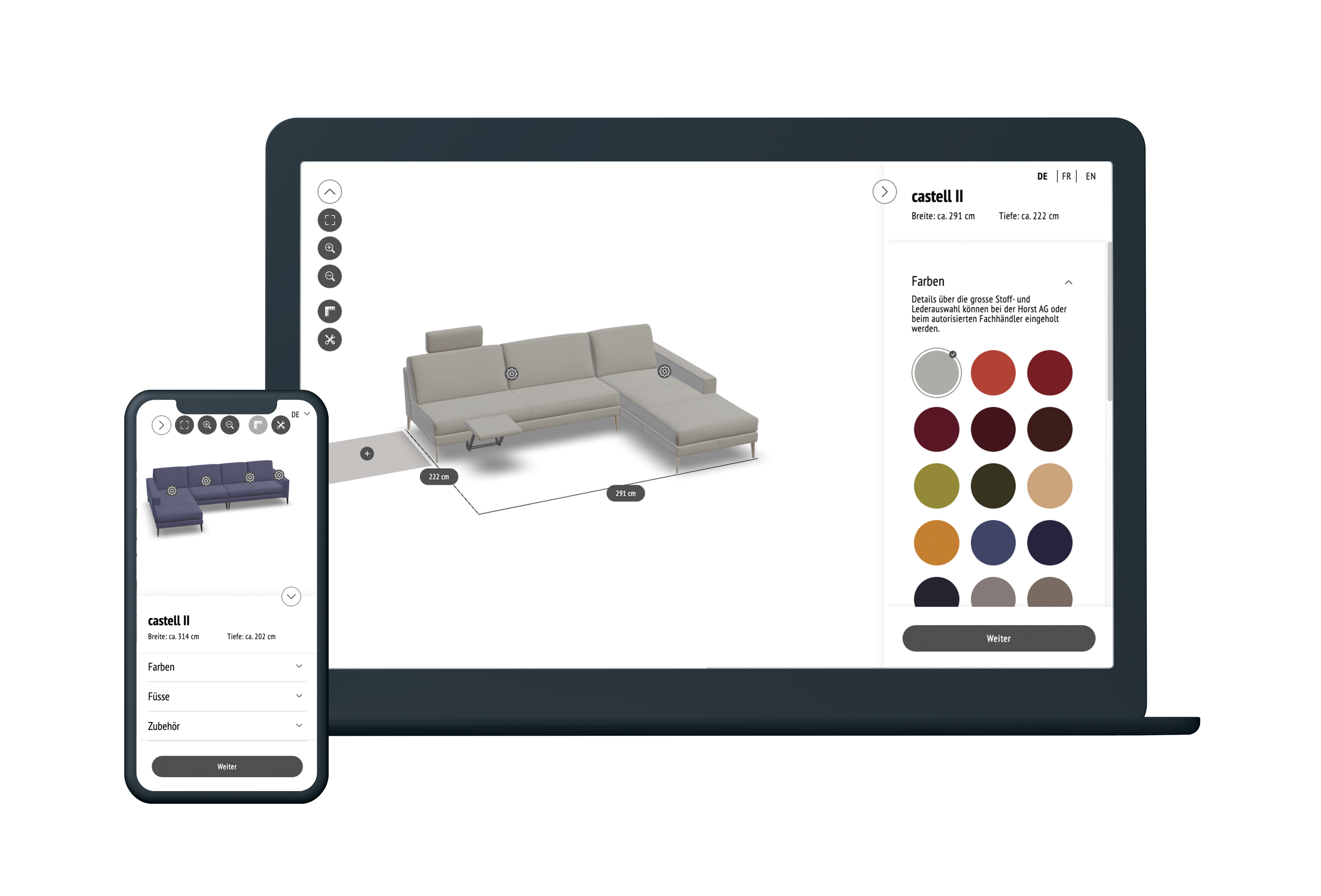
However, when using 3D visualizations in UX/UI design, it is important to ensure that they are used sensibly and purposefully. They should not be used on a website or application simply for decorative reasons or for no purpose. They are intended to be used in a targeted manner to improve user experience and functionality. Three-dimensional elements can make the overall picture more attractive.
Trend 3 - Animations & Micro-Interactions
Component animations and micro-animations such as buttons, transitions or animated cursors are used to represent movements and changes on the screen to provide users with feedback and context. This means they will move or react to user actions. In this way, they can help to make navigation and interaction with a product easier and more intuitive by visually guiding the user. They can be used for transitions, feedback or interactions and thus improve clarity and comprehensibility and accompany the user in a lively and entertaining way.
Overall, animations and micro-interactions help make the design more realistic, attractive, and better illustrate how the product works - like opening and closing the door on our car showcase.

Trend 4 - AR and VR
AR (Augmented Reality) & VR (Virtual Reality) are still on the rise in the field of UX & UI design. These technologies allow users to connect a virtual world with the real world, creating an even more realistic and interactive experience. In the past, AR & VR were mainly found in games and entertainment media, but are now being used more and more in areas such as e-commerce, marketing and even medicine.
AR (Augmented Reality) can be used, for example, to test products virtually, such as trying on new glasses at Mister Spex or placing pieces of furniture in the room before buying them.
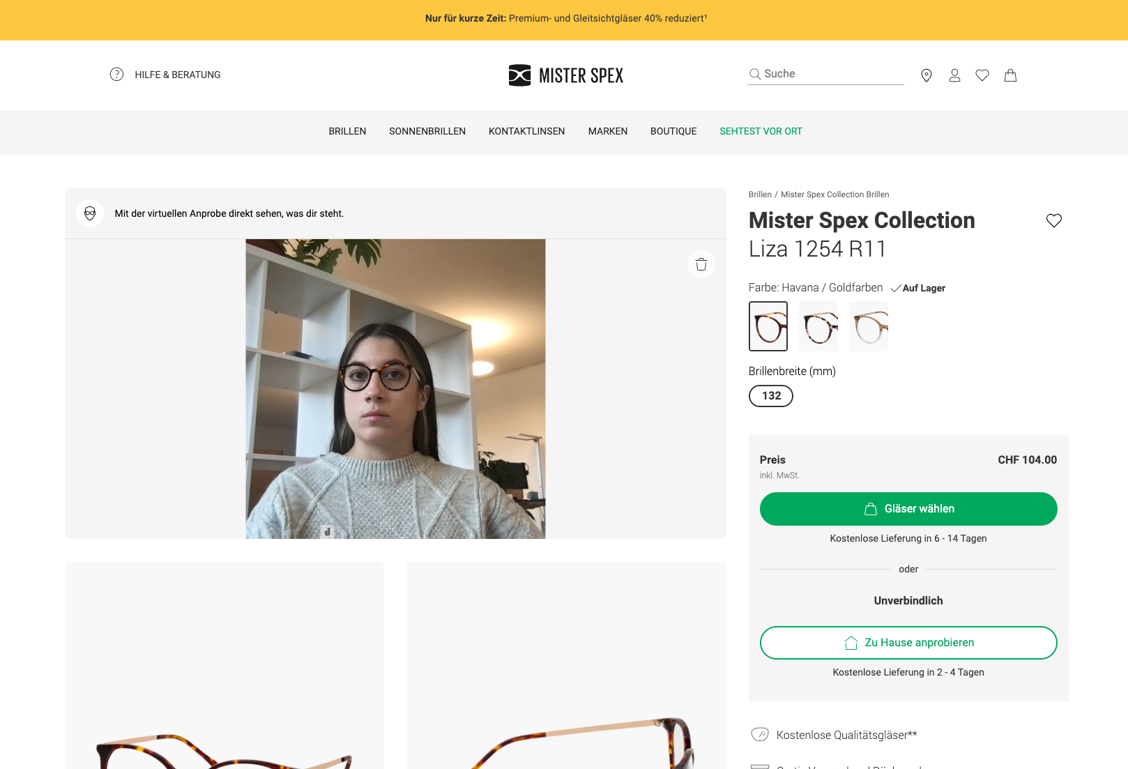
VR (Virtual Reality) allows users to enter a virtual world and experience an up close experience without having to leave their location.
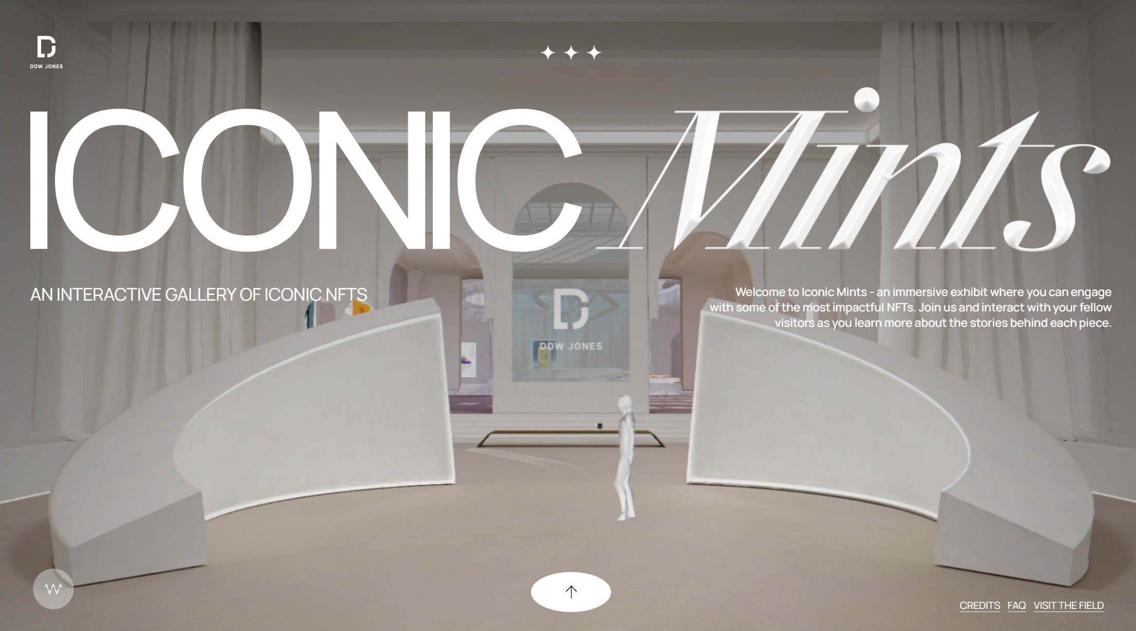
In the coming years, it is expected that AR and VR will become even more the focus of UX & UI design and open up new possibilities for interactive and immersive experiences (diving into an illusory world), as in this interactive exhibition for NFTs .
Trend 5 - Retro and Brutalism
Nostalgia (90s/Y2K (Year2000)) and Brutalism (anti-design) are trends bringing back designs from the past when everything was more personal, more natural and less overdone.
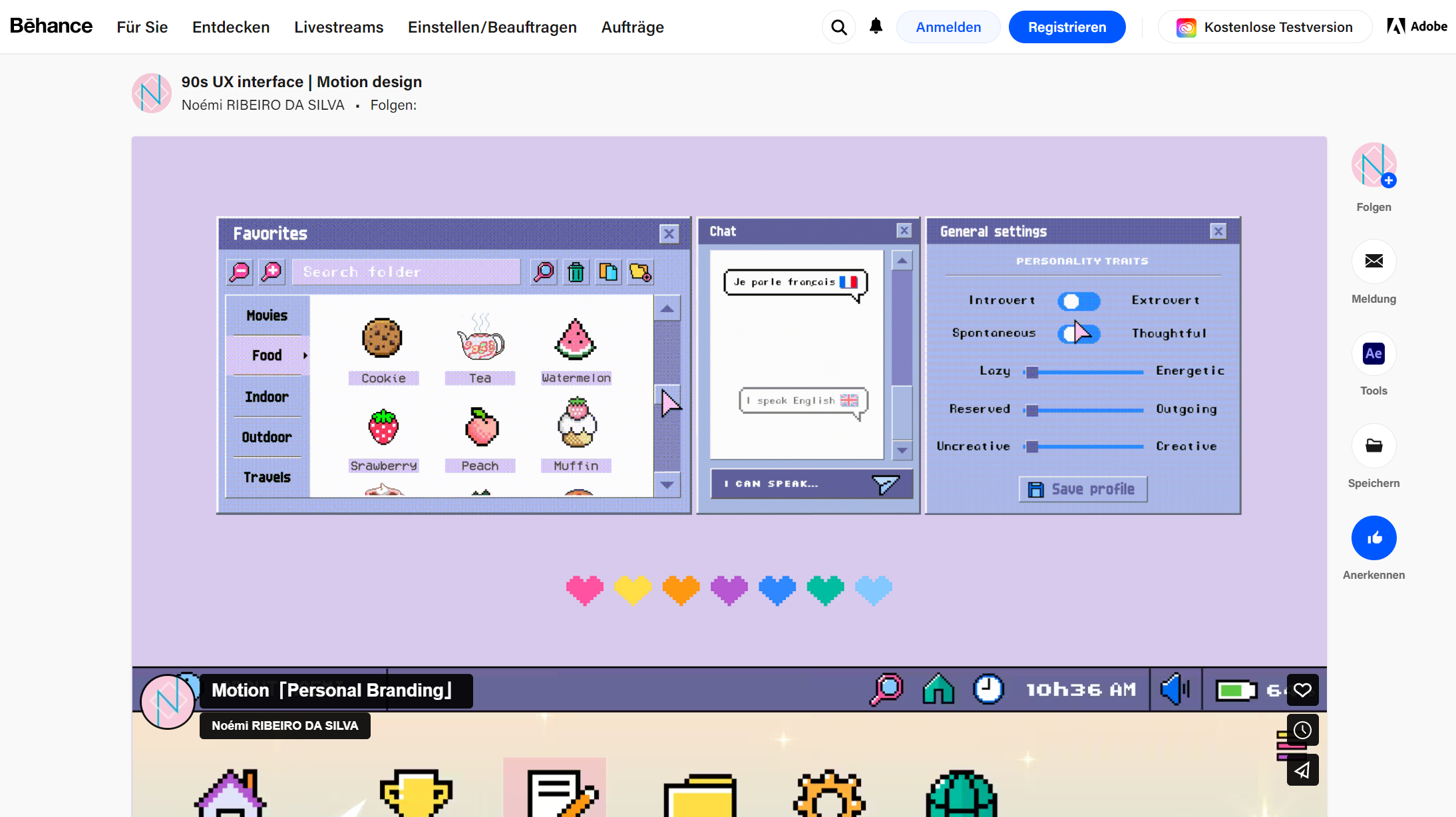
This trend is based on the time of experimentation and the discovery of the new medium Internet. It was also the time of simplicity and limitation as technology was still in its infancy. Some typical features from the 90s that Behance also incorporated into their web design are:
- Simple Layouts : Since there were no established standards or conventions in the early days of web design, layouts were often kept very simple. In order to structure the content clearly, the pages have been divided into several columns.
- Limited color palette : In the 1990s, most computer monitors had a limited color display and the color palettes were therefore a limited palette with mostly light colors such as white, gray and blue.
- Small images: Due to the limited bandwidth in the 90s, images had to be kept small to minimize page loading times. Most of the images were simple graphics or icons that often looked pixelated due to the low resolution.
- Little variety of typography: The fonts pre-installed on the computer, such as Times New Roman or Arial, were mostly used.
- Easy Navigation: Navigation on 90s websites was simple, often with a simple navigation bar at the top or left of the page.
Y2K (Year2000)
The Y2K web design trend refers to the aesthetic that was popular in the web design industry in the late 1990s and early 2000s. Here are some typical characteristics of Y2K web design:
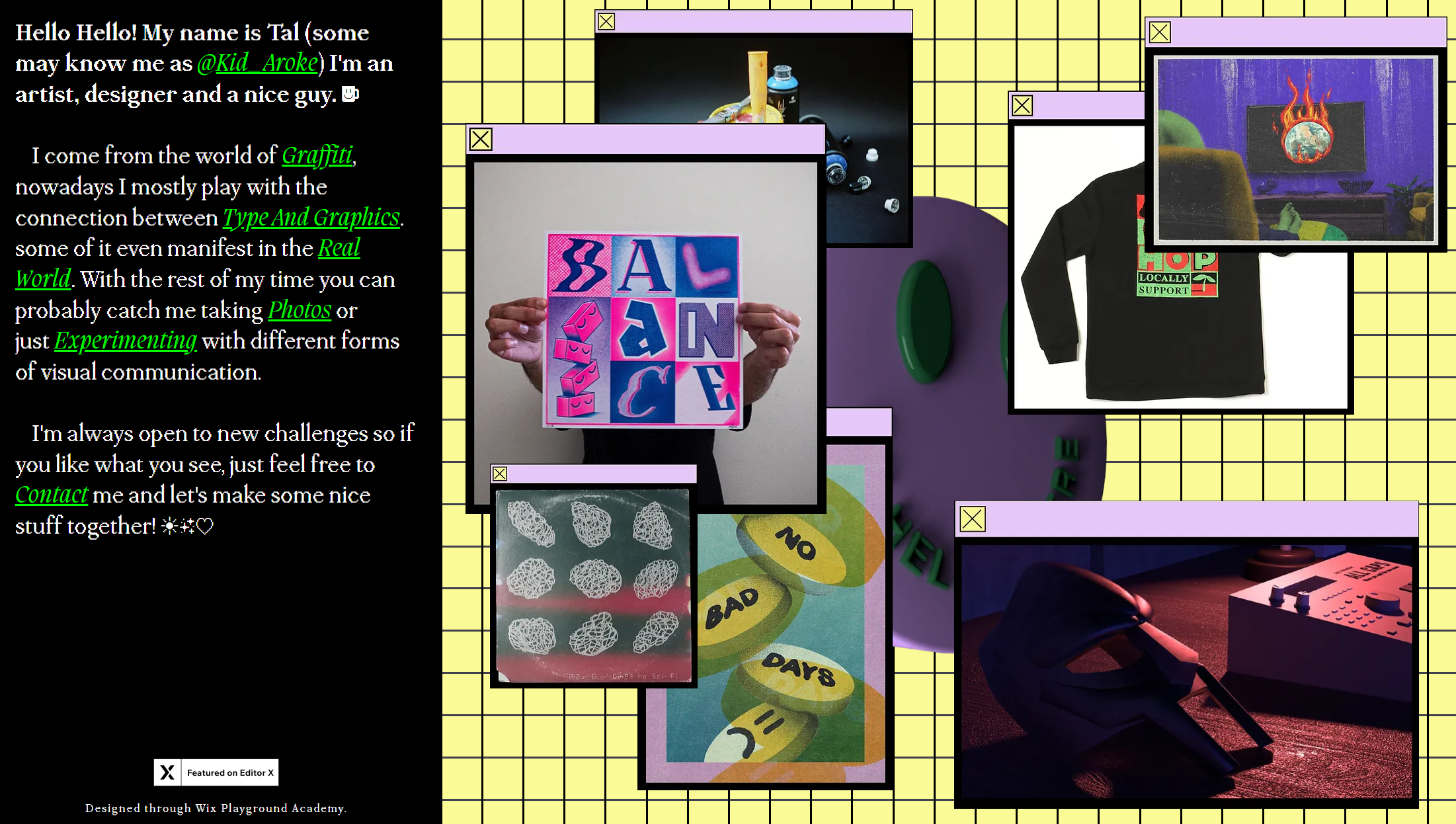
- Bold, colorful color palette , often in bright neon or pastel tones . These colors are often used in combination with shiny or iridescent effects to create a futuristic aesthetic .
- Pixelated graphics and animations reminiscent of the early days of the internet are often used. The images are often kept very simple, with clear lines and strong contrasts.
- Irregular shapes and asymmetrical layouts that evoke the aesthetics of the cyber world. This can help the website look more futuristic and dynamic. With the use of 3D effects and animations , depth and movement are created on the page. This can be achieved using shadows, reflections and other visual effects.
- Use of pop culture references from the late 1990s and early 2000s such as comic imagery, sci-fi elements and other iconic designs from the period.
Aroke 's example aptly illustrates how Y2K web design is a throwback to an era of the internet shaped by technology, science fiction, and pop culture references.
Brutalism
Brutalist design is an approach that goes against the conventions of mainstream design and seeks to create a raw, unadulterated appearance. The style is sober and minimalist, with functionality taking precedence over form and effectiveness over aesthetics. Brutalism is a design style that emerged in the field of architecture in the 1950s, as the Bauhaus website shows.
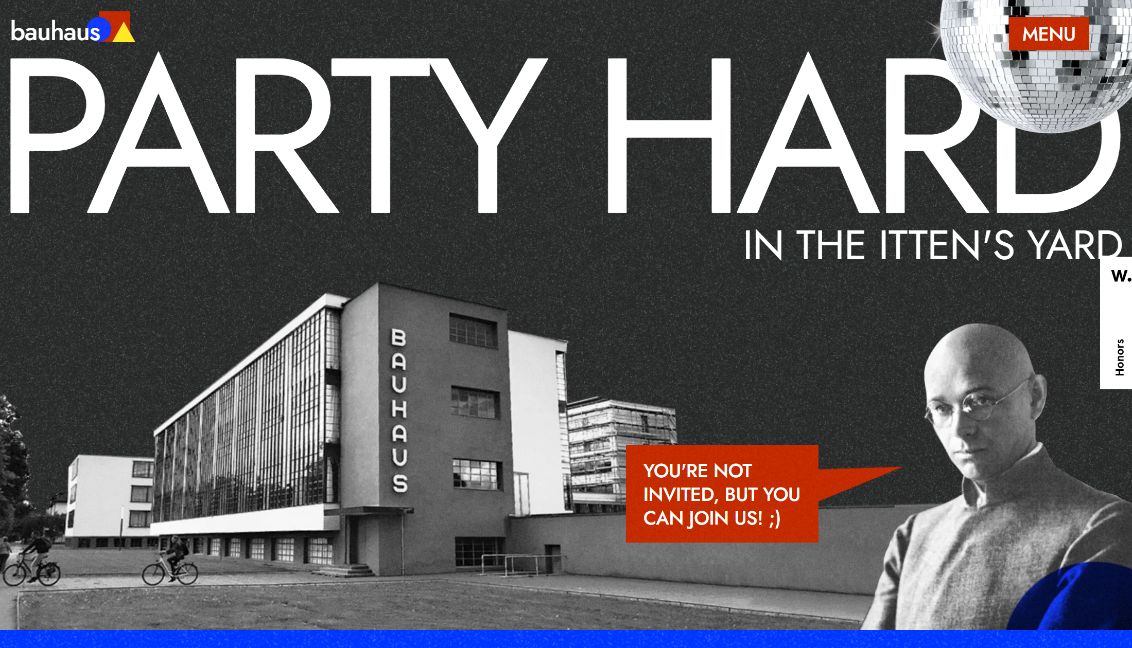
Here are some typical traits of brutalism in web design:
- Rough and edgy layouts to create a raw and unpolished look.
- Unconventional typography : Usually, serif fonts are avoided and fonts with a large weight are used instead, in order to create a strong visual contrast . Punctuation and alignment are also often omitted in order to achieve an unconventional appearance.
- Color schemes are often monochromatic, muted tones to create a minimalist yet striking design . Textures such as grids, lines or other geometric shapes are included to reinforce the design.
- On Brutalist sites, navigation can be unconventional and unpredictable (unusual placement).
The fact that these websites come across as a bit old-fashioned is exactly what makes such designs so charming.
Trend 6 - Minimalist design and reduction to typography
This trend focuses on clarity and simplicity and dispenses with superfluous elements. Only the most important and relevant elements are used. Minimalist design is especially helpful to create easy and intuitive navigation.
Important components of the minimalist design are the conscious use of typography and plenty of white space to create a visual hierarchy and thus focus on the content . Large and bold fonts are ideal for emphasizing important messages and improving readability. Italic and handwritten fonts add a personal touch to a design and can make for a friendlier and more approachable user experience. Sans serif fonts have grown in popularity in recent years. They are simple, modern and very readable, which makes them ideal for mobile applications of websites. Dynamic fonts have the ability to adapt in real time to changing conditions, such as different screen sizes or color schemes. Using custom fonts is an increasingly popular trend in UX/UI design. They can make the brand and design unique and help build a strong brand identity.
The modern but simple design perfectly embodies the basic values of quality, tradition and innovation of our customer Jura Holzbau .
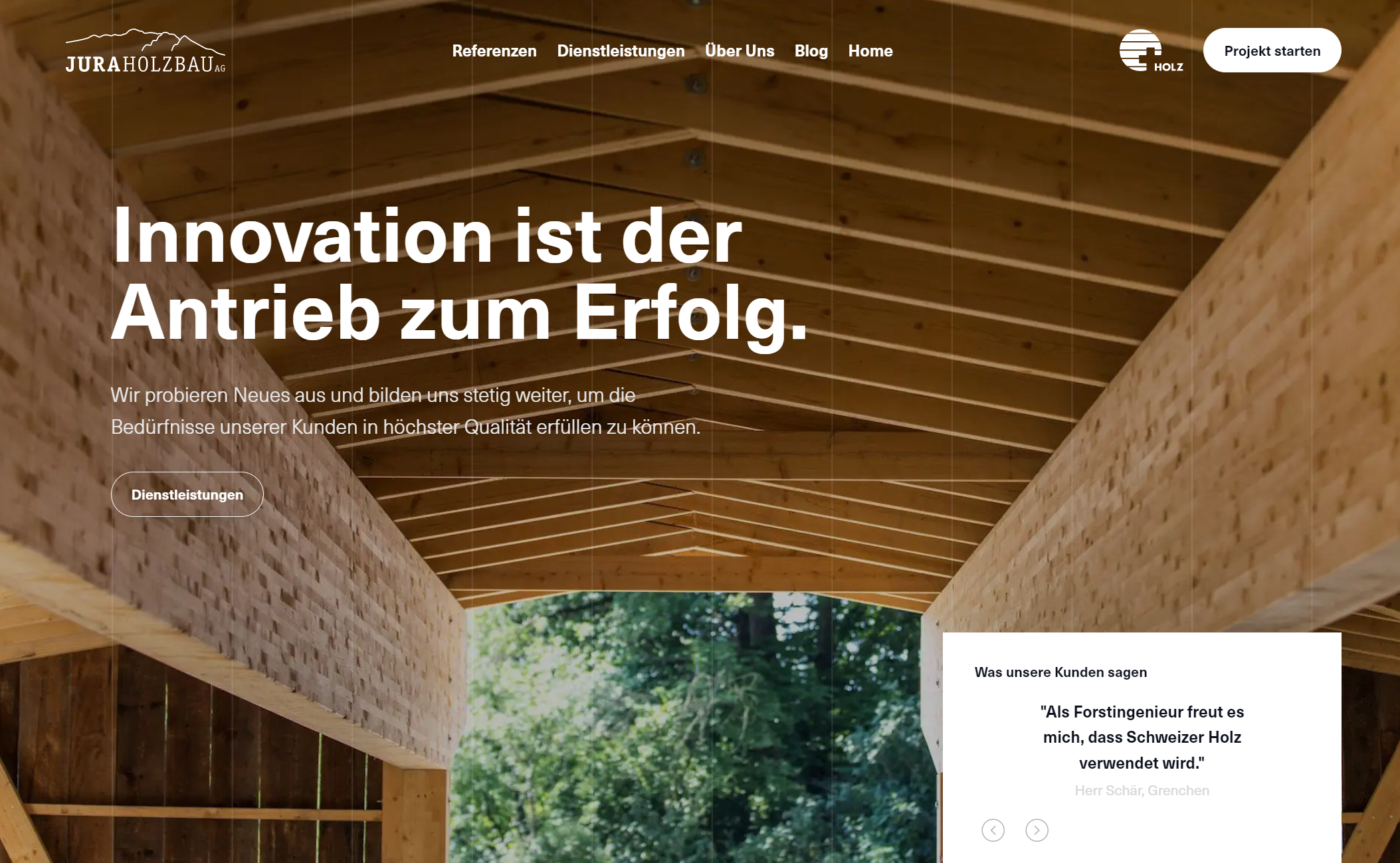
The minimalist design trend will continue to gain momentum, as page speed (webpage load time) is an official factor in search engine (SEO) ranking . All integrated resources, such as data, documents and images, consume transmission time. If a lot is left out in the design, the loading time can be shortened and a better placement is possible. When implementing a minimalist design, however, it is important to find the right balance between clarity and simplicity. Too much minimalism can result in missing important information and detracting from a positive user experience.
Trend 7 - Dark Mode
Dark mode themes (also called night mode) are gaining popularity in UI design because of their aesthetics. Instead of the traditional dark, black text on light, white backgrounds, light text is placed on darker backgrounds. But it doesn't have to be black. A darker color palette is pleasing to the eye, user-friendly, and offers an interesting user experience (UX).
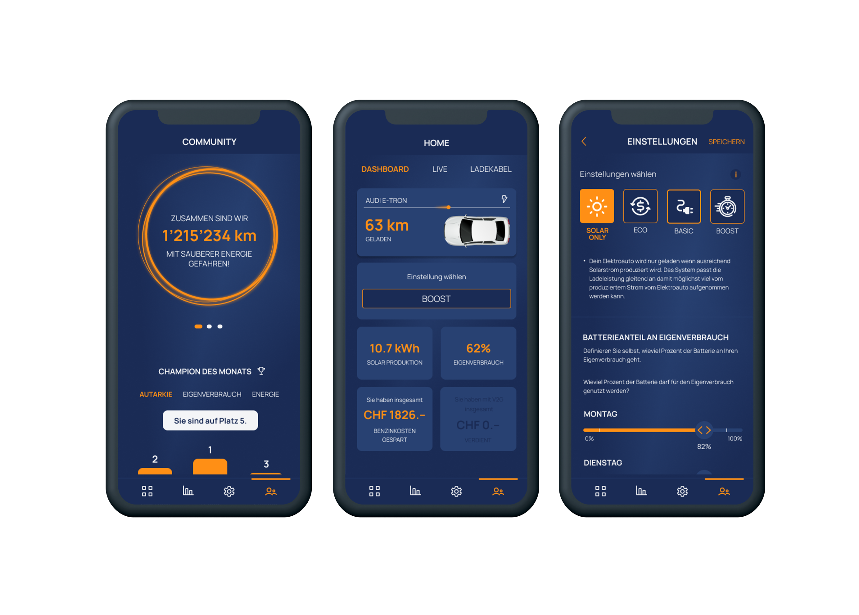
Dark themes look elegant and modern. Content stands out better against a dark background, and you can guide users and create an engaging experience for them. It is also believed that the dark mode UI design helps users to use their devices longer without straining their eyes or being exposed to too much blue light. On some websites, users can choose between the light and dark variants. Many users choose the dark mode theme because it allows them to work, study, or surf comfortably in dimly lit environments without straining their eyes. In addition, dark mode applications consume less battery, resulting in devices that can be used for longer. A dark theme was used for the design of the mobile app (intelligent management for bidirectional charging stations) for our customer sun2wheel .
Trend 8 - Accessibility and Inclusive Design
Website accessibility refers to a website being designed and developed to be accessible and usable for people with different abilities and disabilities. Accessibility refers to designing websites that are accessible to people with visual impairments, hearing impairments, motor disabilities, or cognitive impairments. An accessible design should enable these users to access and use the content of the website, regardless of their abilities or the technical devices they use. Accessibility is not only an ethical approach, but also a legal requirement in many countries.

There are several ways to improve website accessibility, such as:
- Use of clear and concise descriptions to describe the content of a web page. Use of fonts that are easy to read and the ability to change the font size to improve readability.
- Use of alternative text (alt tags) for images and other visual elements to describe the meaning of these elements and to make them accessible to people with visual impairments.
- Use of color contrasts to make the content easier to read.
- Using subtitles and transcriptions for audio and video content to make it accessible to people with hearing disabilities.
- Using keyboard usability to allow users to control the website with keyboard shortcuts when they cannot use a mouse due to motor limitations.
- Avoiding blinking and flickering to prevent seizures in people with epilepsy.
- Yes, voice control is also a way to improve the accessibility of websites. Voice control allows users to control a website by speaking commands or questions instead of using a mouse or keyboard. This can be especially useful for people with motor disabilities or visual impairments who have trouble using the mouse or keyboard.
This leads to the next trend of voice controlled websites.
Trend 9 - Conversion-based user interfaces
Conversational user interfaces (CUIs) are a type of user interface that allow users to interact with computer programs or applications using natural language or text. Unlike traditional graphical user interfaces that guide users through the use of buttons and menus, CUIs attempt to interact with users through natural language voice commands and provide clear answers to help them achieve their goals.
However, there are also some challenges when developing CUIs, especially when integrating artificial intelligence (AI) and natural language processing (NLP). The technologies must be developed in such a way that they can understand and interpret human language in order to enable meaningful responses and interactions.
Trend 10 - Artificial Intelligence
Artificial Intelligence and Machine Learning: AI and ML are becoming increasingly important in optimizing user experiences. These technologies are used to provide personalized recommendations and predictions to improve usability.
Artificial intelligence (AI) and machine learning (ML) can be used on websites to optimize the user experience (UX). Here are some examples of how this can be done:
Personalized recommendations: AI and ML can be used to provide users with personalized recommendations based on their interests, search history, click behavior or other data. This can lead to better UX by allowing users to find relevant content quickly. Chatbots and Virtual Assistants: Chatbots and virtual assistants powered by AI and ML can be used to help users navigate the website and find relevant information or products. This can improve UX by allowing users to quickly access answers and information. Predictions and Optimizations: AI and ML can also be used to make predictions and make optimizations to improve UX. For example, AI and ML can be used to predict which content and features are used the most and which are not, and optimize the website accordingly. Accessibility: AI and ML can also be used to improve the accessibility of websites. For example, AI can be used to automatically translate text into other languages, automatically generate subtitles for videos, or even create image descriptions for people with visual impairments. Personalized Prices: AI and ML can be used to create personalized prices for products and services on a website. These prices are based on user demographics and purchase histories, and can help improve the UX by showing users relevant offers and prices. Image recognition: AI and ML can be used to automatically recognize and categorize images on a web page. This technology can help users find relevant images faster and improve UX. Enhanced Search: AI and ML can also be used to enhance search on a website. The technology can help users find more accurate results faster by recognizing synonyms and similar search terms and prioritizing relevant results. Security: AI and ML can also be used to improve website security. For example, they can be used to automate the detection of cyber attacks or to identify attempted fraud.
AI and machine learning offer numerous opportunities to optimize the UX of websites. The technology is constantly evolving and offering new areas of application to better meet the needs of users.
Conclusion
We've highlighted some of the strongest trends here. No matter which one you choose, a website redesign offers many advantages to improve your website and make your visitors happier:
- A new design improves the user experience on a website and increases the time visitors stay on the page.
- A modern design can build trust and credibility with potential customers.
- Revamped navigation can make it easier for visitors to navigate your site and quickly find what they're looking for.
- An updated aesthetic can modernize your brand and make it feel more contemporary.
- An optimized mobile version of your website increases user-friendliness and thus generates more traffic.
- A redesign can shorten the loading time of the website, which has a positive effect on the search engine ranking.
- This is an opportunity to add new features and content that will engage and retain visitors.
- A redesign can also help eliminate potential security risks on your website and keep visitors safe.